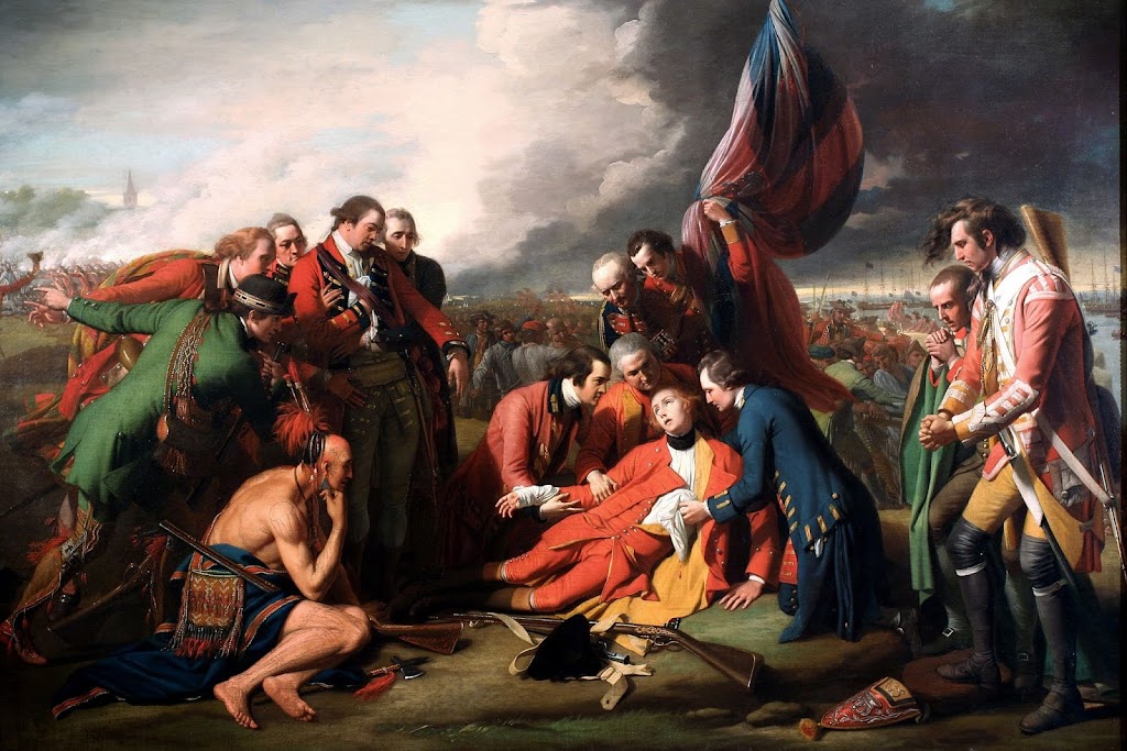
History paintings are like data visualizations. Here, NYT’s Jason Farago presents Benjamin West’s 1770 painting “The Death of General Wolfe.”
If your dashboard looks like West’s painting, you are in trouble. Then you need a Jason Farago to make it accessible to the management team. Dashboards summarize data, as West did in this history painting in 1770 (accurately or not -See Jason’s walkthrough on that). The higher the density of information, the lower the chances of communicating successfully. Businesses increasingly need data translators or communicators, not so much “data artists.” West is the data artist. Jason is the data translator. West skillfully abuses ggplot and matplotlib for the sake of art. Jason further masters Plotly, Shiny, and Dash.
