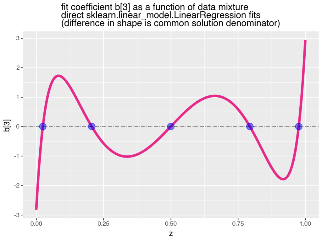
This plot shows how coefficients in a linear model can change (not only in effect size, but also in sign) as new data is added to the training set (as a result of data or concept drift). Think of it as new retail sales data being added to the set over time.
In the plot, b is the coefficient of interest and z is the proportion of new data (Population 2) gradually added to the existing training data (Population 1). First, all the data is from P1 (so z is 0), then it’s 75% P1 and 25% P2 (z is 0.25), and so on.
As we add more of new data, we observe how the estimated effect changes. It starts out negative, becomes positive, then negative again. When the old and new data are equally mixed (z is 0.50), the previously negative effect disappears.
This thought experiment (by John Mount) reminds me of Lord’s Paradox (John calls it a continuous version of Simpson’s Paradox and that’s another way of putting it).
The data changes, but the model assumptions remain the same, and that’s a problem. This is another example of why staying true to the data, or data centricity, is critical to getting the right insights from models for decision making.
You can find the Python code walkthrough and Jupyter notebook here. If you want to learn more about data centricity, here is a one-pager.